Button
Design annotations are needed for specific instances shown below, but for the standard button component, Carbon already incorporates accessibility.
What Carbon provides
Carbon bakes keyboard operation into its components, improving the experience of blind users and others who operate via the keyboard. Carbon incorporates many other accessibility considerations, some of which are described below.
Keyboard interactions

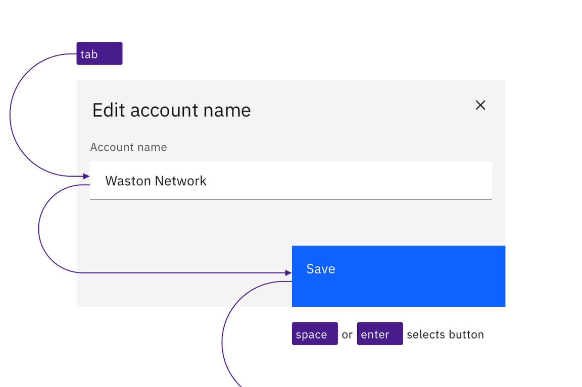
Buttons can be reached by Tab and selected with Space or Enter.
interaction

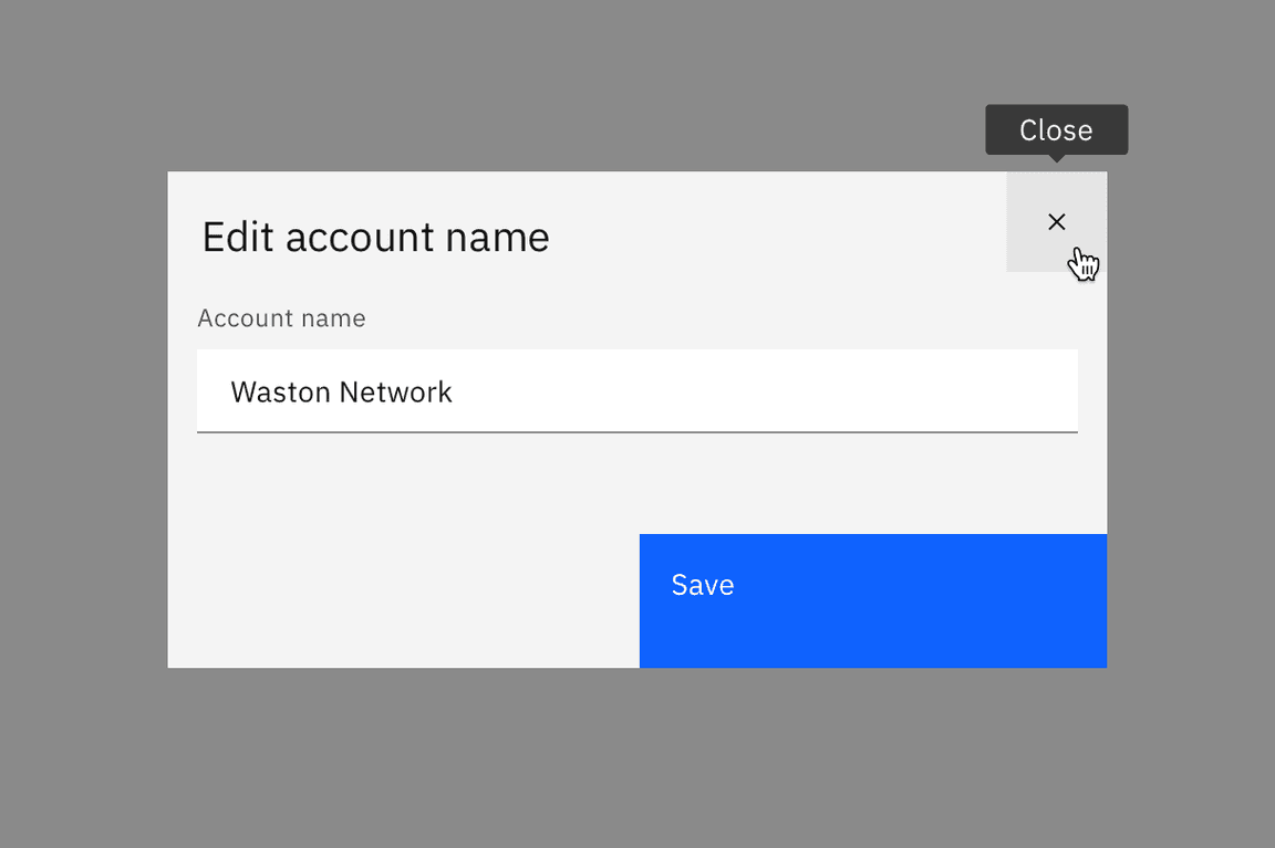
Icon-only buttons have their labels exposed automatically on hover and focus.

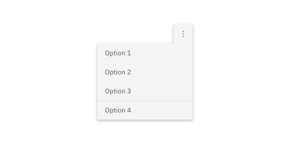
Menu buttons are separate components in Carbon. See Dropdown and Overflow menu.
Design annotations
Design annotations are needed for the following instances.
Labelling
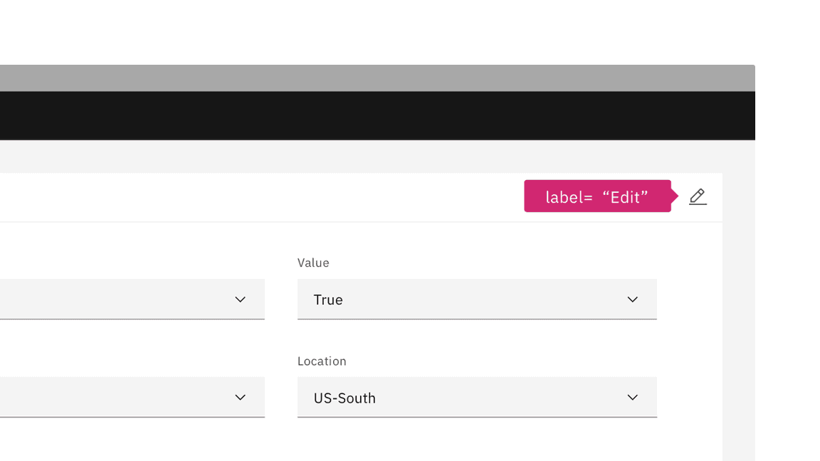
When buttons do not have a persistent label, they must be annotated with a label that will be exposed on hover or focus.

Annotate the label for icon-only buttons so the proper tooltip appears.
Developer considerations
Keep these considerations in mind if you are modifying Carbon or creating a custom component:
- Where links have been ‘repurposed’ as a button, they need to be coded so the
Spacekey can also activate (since links are only activated by default byEnter). - Toggle buttons can be accessibility supported by changing the value of
aria-pressedbetween"true"and"false"or with a change of name that reflects a change in the icon shape (for example: “play” / “pause” ) - See the ARIA authoring practices for more considerations.